Embroidery logo colours: how many?
Fewer colours usually stitch better: each colour is a separate thread and a stop to change it. Merge near-identical shades, drop gradients and shadows, and keep only the colours the logo needs to be recognised.
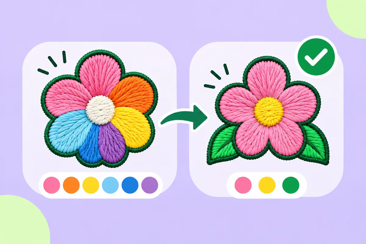
There is no ideal number of colors for an embroidered logo; as a general rule, fewer is better. Each color corresponds to a separate thread; every time the color changes, the machine must pause so the thread can be replaced, a process that often involves cutting the thread. A logo consisting of a few solid colors results in a clean, crisp look. A logo that incorporates many nearly identical shades does not necessarily look better once embroidered; it simply requires more time and, in most cases, results in a higher cost. This guide explains why this is the case, and how you can reduce the number of colors without compromising your brand identity.
What a colour means in embroidery
On a screen, adding a colour costs nothing. In thread, a colour is a physical thing: one reel of thread, one block of stitching, one stop. Each extra colour adds:
- A colour change. On a single-needle machine, someone has to swap the thread by hand. On a machine with several needles, each colour needs its own needle loaded.
- Trims and jumps. Moving to the next block of that colour usually means cutting the thread.
- Sewing time. More changes mean more stops, even when the stitch count stays the same.
- Cost. Many providers quote by colour count as well as stitch count. See how much logo digitizing costs.
How many is too many?
There is no strict limit; it all depends on the machine, the placement, and the design. As a general rule, a small logo works well with a few solid areas of color; beyond that, every additional color must justify its inclusion. For each color, ask yourself: would the logo remain legible if this color were merged with the one adjacent to it?
Size also plays a role. A tiny area occupied by a third or fourth color must have enough space to allow for proper embroidery. A splash of color that covers only a few stitches can look like a mistake. See minimum text size in embroidery for the same problem in lettering.
Gradients, shadows and near-identical shades
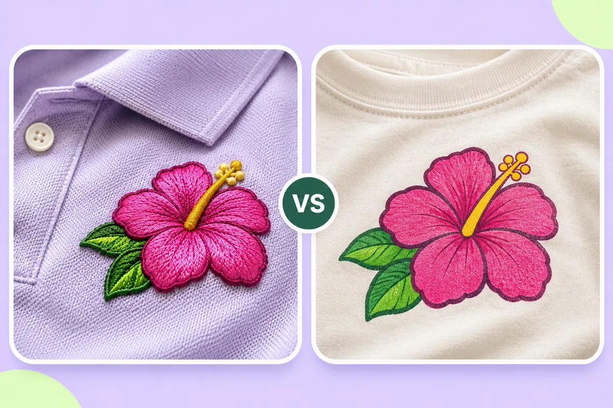
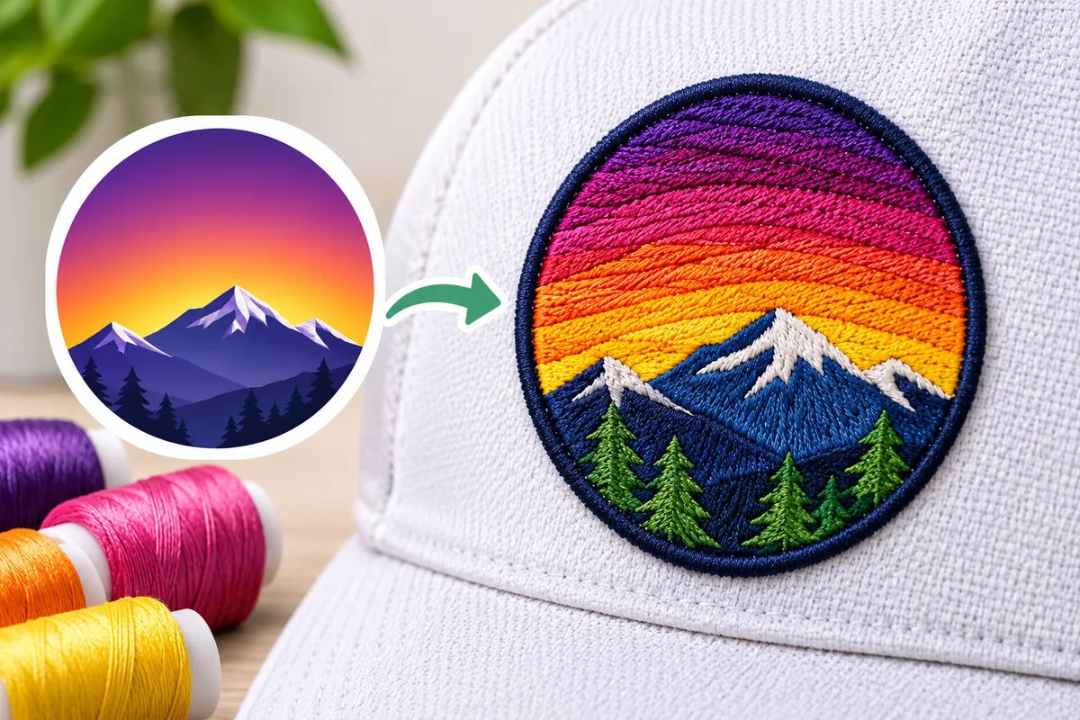
Gradients and soft shadows often lead to an excess of colors. Since embroidery threads come in solid, uniform shades, it is impossible to replicate the fluid blending seen on a screen. Achieving a gradient effect requires a wide variety of colors and meticulous manual labor; even then, the final result will differ from the original illustration.
Instead:
- Flatten gradients into a few solid bands, or into the single colour that suits them.
- Remove drop shadows. A shadow is rarely worth a colour of its own.
- Merge near-identical shades. Two blues that look the same on a screen usually look the same in thread.
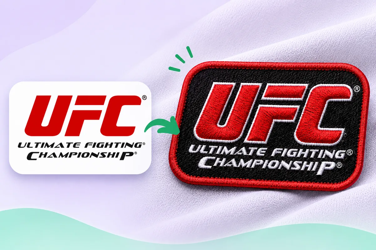
If your logo is a PNG or JPG, remember that the soft edges around each shape contain blended pixels, which look like extra colours to a converter. A clean logo with sharp edges is much easier to reduce to the colours you want. See how to prepare a logo for embroidery.
The background and the garment
Embroidery does not usually stitch the background. The colour of the fabric is the background, and that changes how the thread colours look:
- Check contrast against the garment. Dark thread on a dark garment, or light thread on a light one, can nearly disappear.
- Leave the background out. A background block adds stitches and colour changes for nothing.
- Think about an outline. A thin border in a contrasting colour can keep a logo readable on different garment colours.
Matching brand colours
Thread is sold in predefined color ranges; therefore, the exact shade specified in your brand guidelines may not exist. Choose the closest match and, whenever possible, compare it against a physical color chart, as the appearance of a color can vary between a screen and an actual spool of thread. If maintaining precise brand-color accuracy is essential, perform a test sew on the final fabric.
Colours and the file you send
An embroidery file records a color change as a stop. DST and EXP formats do not contain information regarding thread colors; therefore, it is the responsibility of the machine operator to select the appropriate threads. Include a list of the colors in the order in which they are to be embroidered along with the file. See which file: DST, PES, EXP or JEF?.
How to simplify a logo
- List the colours. Write down every distinct colour in the artwork.
- Flatten gradients and remove shadows.
- Merge near-identical shades.
- Drop tiny colour accents that are too small to hold stitches.
- Check contrast against the garment colours you will use.
- Preview the result and test-sew a sample.
The converter on this site finds the colours in your PNG or JPG and lets you choose which to keep. In the editor you can also change a layer's thread colour to see how it would look; the stitches themselves stay the same. Upload a logo and look over every stitch in the preview. Automatic results can need editing, so test-sew before a full run.
FAQ
How many colours can an embroidery logo have?
There is no fixed number. It depends on the machine, the size and the design, but fewer colours are easier to sew and usually cheaper.
Does every extra colour cost more?
Many providers quote by colour count as well as stitch count, because each colour adds changes and sewing time.
Can I embroider a gradient?
Not as a smooth blend. Thread is solid, so gradients are normally flattened into a few bands, or reproduced with extra colours and manual work.
Will the thread match my brand colour exactly?
Often not exactly. Thread comes in fixed ranges, so choose the nearest match and check it on the real fabric.