Gradients and photos in embroidery
Thread comes in solid colours, so gradients and photos do not stitch the way they look on screen. Simplify the artwork into a few flat colours and clear shapes before converting, then check the preview and sew a sample.
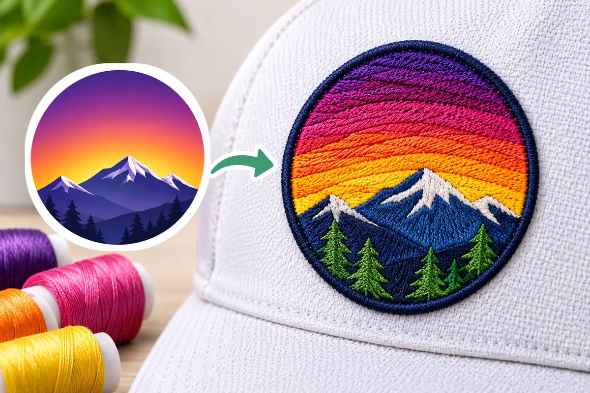
Thread comes in solid colors. A photograph or a smooth color gradient, by contrast, contains thousands of shades that blend into one another. It is precisely this mismatch that accounts for almost all the difficulties encountered by those who attempt to embroider visuals of this kind.
Why gradients are hard
A screen can show a smooth blend from dark blue to light blue. Embroidery cannot. Each area of stitches is one thread colour. To suggest a blend, you have two options:
- Steps: use a handful of separate shades, each in its own area. The blend becomes visible bands.
- Mixed stitches: overlap stitches of two shades so they merge from a distance. This takes skilled manual work and only suits larger designs.
Automatic conversion usually chooses steps. It reduces the picture to a limited set of colours, so a gradient turns into stripes.
Why photos are harder still
A photograph contains precise details, soft shadows, and subtle skin tones, all of which add to the problem. Embroidery stitches are physical elements with a specific width and thickness; they cannot reproduce details at the pixel level. Converting a photograph directly often results in a blurry, muddled image: details are lost, shadows turn into solid, dense areas, and the design can appear stiff and heavy.
While there are techniques for creating photographic-style embroidery, this is a specialized process that requires meticulous planning and a large embroidery area. It is not an appropriate approach for standard logos or small designs.
What happens when you convert one
If you upload a gradient or photo to a converter, expect:
- Banding: the blend breaks into visible stripes of flat colour.
- Too many colours: the software may use a long list of near-identical shades. See Embroidery logo colours: how many? for why that is a problem.
- Stiff, dense areas: dark regions fill in heavily and the design feels hard.
- Lost detail: small features disappear or turn into blobs.
How to simplify artwork
You can get a good result from a gradient logo if you adapt the artwork first.
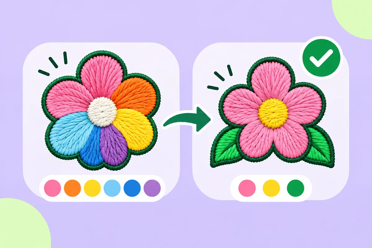
- Replace the gradient with two or three flat colours. Choose clear steps with obvious boundaries rather than a smooth blend.
- Use a single colour where the gradient is subtle. If the shift is gentle, one shade usually reads fine.
- Remove shadows and glows. Drop effects that exist only on screen.
- Enlarge important details or delete them. If a feature is too small to stitch, make it bigger or leave it out.
- Separate shapes clearly. Thin gaps between shapes help each colour stay distinct.
For wider advice on cleaning up artwork, see how to prepare a logo for embroidery.
Choosing the right stitch for blended looks
Some patterns use a variable-direction fill or a textured motif to add visual interest without photographic blending. This helps limit the number of colors while adding depth. This technique is particularly well suited to large shapes. To learn more about how the fill behaves in relation to a satin finish, read Satin stitch vs fill stitch.
When a gradient is fine
Some gradients convert acceptably:
- A large background shape with a gentle shift, simplified to two tones
- A logo where the gradient is only a decorative accent
- A design where the banded look suits the style
If the stepped look is acceptable, you can proceed without changing much.
When to choose a different method
If the design is a photograph, or if meticulous detail is the most important element, embroidery may not be the ideal solution. Other techniques are better suited for reproducing photographic detail; however, you could still choose embroidery to incorporate text or a simplified emblem on the same product.
Check the preview, then the sample
A preview of the stitches shows how the software has reduced the number of colors and where banding may occur. However, it does not provide a clear sense of the density of the embroidered areas. Create a sample to evaluate the weight or stiffness of the final result. Automatic results can need editing, so always test-sew on a scrap of similar fabric before proceeding with the final embroidery.
Where to start
Take your gradient artwork, reduce it to a few flat colours, then upload it to the converter on this site. Check the preview for banding and stray extra colours, simplify again if needed, and sew one sample before committing.
FAQ
Can embroidery reproduce a gradient?
Not smoothly. Thread is solid colour, so a gradient becomes steps of flat shades unless a skilled digitizer blends stitches by hand.
Can I embroider a photograph?
Photo-style embroidery exists but is specialist work that needs a large area. For ordinary logos, a simplified version works much better.
How do I convert a gradient logo?
Replace the gradient with two or three flat colours before converting, and remove shadows and glows.
Why does my converted gradient look striped?
Converters reduce colours into a limited set, so the blend turns into visible bands.