Satin stitch vs fill stitch
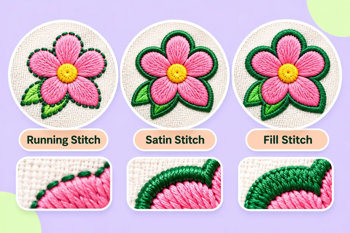
Satin zigzags across narrow shapes for a smooth, slightly shiny band; fill covers wide areas with rows of short stitches. Use satin for narrow parts such as lettering and borders, and fill for wide areas, where long satin stitches would snag.

Satin and fill are the two stitch types that do most of the work in an embroidered logo. Satin zigzags back and forth across a narrow shape to make a smooth, slightly shiny band. Fill covers a wide area with rows of short stitches. The rule of thumb is simple: narrow parts are satin and wide parts are fill. This post covers how each one looks, what it is good for, and where that rule starts to bend.
What satin stitch is
In a satin column, each stitch runs straight across the shape from one edge to the other, and the stitches lie side by side like threads on a spool. The result is smooth and slightly raised, and it catches the light, which gives it the glossy look people associate with embroidery.
Satin suits narrow shapes:
- the strokes of lettering
- borders and outlines with some thickness
- thin petals, stems and other slender parts
Satin has limits on both sides. If a shape is too narrow, the thread cannot form a clean column and the shape clogs up (see minimum text size in embroidery). If a shape is too wide, each stitch is very long. Long stitches sit loosely on the fabric, can snag, and may sag or lift. When a shape is too wide for satin, it is better stitched as fill.
What fill stitch is
In a fill, the area is covered with many rows of stitches that run in one direction. The stitches in neighbouring rows are staggered, so the needle holes do not line up in obvious lines. The direction of the rows matters: it changes how the light falls, so two fills in different directions can look like slightly different shades of the same thread.
Fill suits wide areas, such as large blocks of colour, backgrounds inside a shape and the body of a bold letter. It is less suited to narrow shapes: rows packed into a thin sliver can look lumpy, and the edges may not look as crisp as a satin edge.
Satin and fill side by side
- Look: satin is smooth and glossy; fill is flatter and shows its row direction.
- Suits: satin suits narrow shapes; fill suits wide areas.
- Stitch count: the count of a fill grows with the area it covers; the count of a satin column grows with the length of the band. See stitch count and density explained.
- Where it fails: satin fails when the shape is too wide or too narrow; fill fails on slivers and thin details.
Underlay and edges
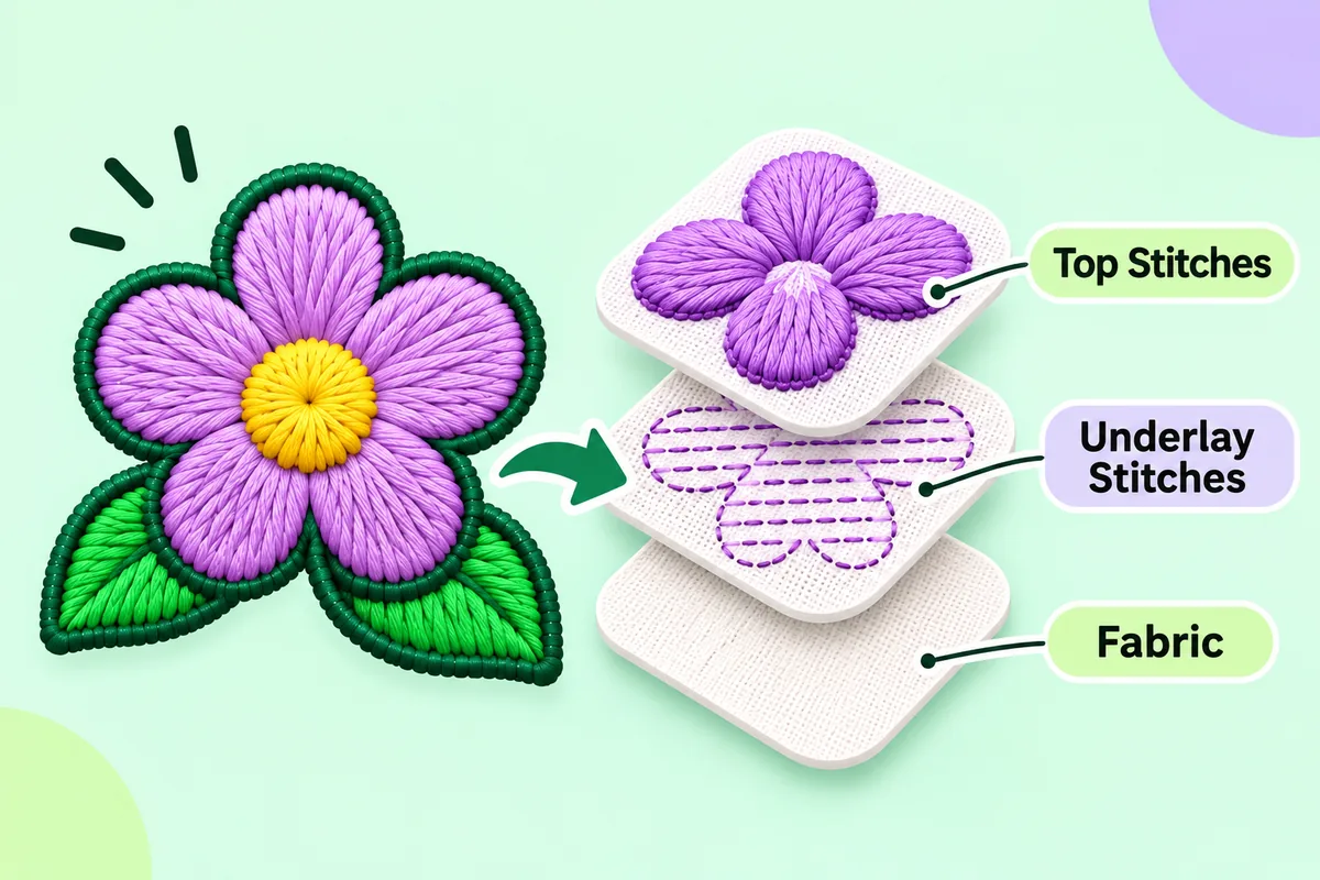
Most shapes, whether satin or fill, get a layer of underlay stitches underneath. Underlay helps the top stitches sit flat and gives them something to rest on, which matters most on soft or stretchy fabric.
Edges are where the two types often meet. A common approach is to fill a large shape and add a narrow satin border around it, which gives a crisp outline and hides the ragged edge of the fill. Very thin lines that are too narrow even for satin are usually stitched as a single running stitch instead.
Shapes that change width
Real logos are not made of evenly sized strips. A stroke may taper, a script letter may swell and thin, and a petal may be narrow at one end and wide at the other. For these shapes, the choice is not all or nothing:
- Satin can cover the narrow part and fill the wide part, so the shape switches type where it widens.
- A shape that is only slightly too wide can sometimes be split into two satin columns.
- If neither works, simplifying the artwork is often the cleanest answer.
Choosing in practice
- Look at the width of each part of the logo. Narrow means satin, wide means fill.
- Check the stitch type in the preview. Look for long satin stitches across wide shapes and lumpy fills in thin ones.
- Change a shape's type when the automatic choice looks wrong. In the editor on this site you can switch a shape between running, satin and fill.
- Test-sew. The only reliable check is thread on fabric. Automatic results can need editing, so sew a sample before you commit to a full run.
When you are ready to see your own logo as stitches, upload a PNG or JPG and look over the preview. For the whole path from artwork to file, read logo to embroidery file, step by step.
FAQ
Which is better, satin stitch or fill stitch?
Neither is better overall. Satin suits narrow shapes and fill suits wide ones, so most logos use both.
Can I use satin stitch for a large area?
Usually not. Very long satin stitches sit loosely and can snag or lift, so wide areas are normally filled.
Which uses fewer stitches?
It depends on the shape. A fill uses more stitches as the area grows; a satin column uses more as the band gets longer.
Why does my fill look like a different colour from the satin next to it?
The direction of the stitches changes how light reflects off the thread, so the same thread can look lighter or darker depending on the direction and the stitch type.