Pull compensation in embroidery
Stitches draw the fabric inward, so shapes sew narrower than they look on screen. Pull compensation makes shapes slightly wider in the direction of the pull to make up for it. The fabric changes how much is needed, so test-sew.
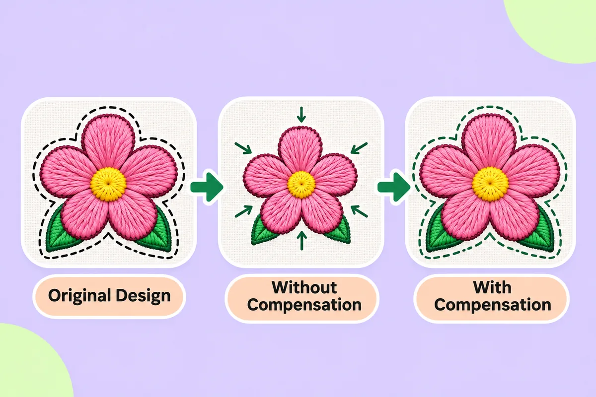
You check a logo on screen, and everything is cleanly aligned. Then you stitch it out, and the circles appear slightly squashed, the letters look thinner, and gaps emerge between shapes that were previously touching. This is known as "pull", and "pull compensation" is the method digitizers use to correct it.
What pull is
During embroidery, the thread is under tension. Each stitch exerts a pull on the fabric, directed inward along the line of the stitch. Across an entire shape, these individual pulls accumulate. Consequently, the finished shape ends up narrower than the original design, in the direction of the stitches.
Furthermore, the needle exerts pressure on the fabric, and the backing (stabilizer) may shift slightly. As a result, the embroidered piece is never an exact reproduction of the digital design; there is always some deviation, though it remains predictable.
What pull compensation does
Pull compensation makes shapes slightly wider than the original design, in the direction of the pull. When the stitches then draw the fabric inward, the shape ends up approximately the desired size.
Think of it as a form of pre-stretching. You are not altering the design itself; you are simply compensating for the effect that the fabric will have on it.
It is most noticeable on:
- Satin columns: these pull across their width, so thin lines can end up thinner than intended.
- Fill areas: the edges can pull in and leave gaps next to neighbouring shapes.
- Small text: lettering is where small errors are easiest to see. See Minimum text size in embroidery for more.
Signs a design needs more compensation
- Thin lines look weaker than the artwork.
- Circles look slightly oval.
- White gaps appear between a fill and its outline.
- Letters look narrow and cramped.
Signs it has too much
- Shapes look swollen or heavy.
- Neighbouring shapes overlap and look muddy.
- Small counters in letters, such as the hole in an "e" or "a", close up.
Why fabric changes the answer
There is no single correct amount. It depends on what you are sewing on:
- Stretchy knits pull and move a lot. They usually need more compensation and better support.
- Firm woven fabrics and cap twill pull less and hold shape well.
- Soft, fluffy surfaces let stitches sink, which can change how shapes look even when the compensation is right.
Stabilizer matters too. A well-stabilized piece moves less, so there is less pull to correct. The same cause sits behind many sewing faults; see embroidery puckering and thread breaks for the wider picture.
How it relates to underlay
The underlay and pull compensation work in tandem. The underlay stabilizes the shape, while the compensation corrects residual movement. If you modify one of these elements, it may be necessary to adjust the other. For the base layer, see Underlay stitches explained.
What automatic conversion does
When software converts a logo for you, it typically applies a standard compensation value to each shape. While this is a reasonable default setting, the software cannot account for the specific characteristics of your fabric or thread. Be prepared to make adjustments if your first sample shows gaps or lines that are too thin.
Edits, if your editor allows them:
- add compensation to thin satin columns
- add a small overlap where fills meet outlines
- reduce compensation on shapes that look swollen
How to test it
The most reliable test is simple. Sew a sample of the logo on the real fabric with the real stabilizer. Then compare it with the artwork:
- Hold the sample next to the printed logo.
- Look for gaps, thin lines and squashed circles.
- Note which shapes are off and in which direction.
- Change one setting at a time and sew again.
Keep the samples. They become a record of what works on each fabric.
Automatic results can need editing, so always test-sew on a scrap of similar fabric before a real run.
Where to start
If you want to see how a logo converts before adjusting anything, upload it to the converter on this site, then sew a small sample. If shapes sew smaller than the artwork, increase compensation on those shapes. If they look swollen, reduce it.
FAQ
What is pull compensation in simple terms?
It is a small adjustment that makes shapes slightly wider in the file, so that after stitches pull the fabric inward, the shape ends up the size you wanted.
Why do my circles sew out as ovals?
Stitches pull mostly in one direction, so a round shape can squash. Better stabilizer and the right compensation usually reduce this.
Do I need to add compensation myself?
Not always. Converters apply a default amount. If your sample shows gaps or thin lines, adjust it in an editor.
Does fabric change how much compensation I need?
Yes. Stretchy knits usually need more than firm woven fabric or cap twill.