Thin lines and outlines in logos
Thin lines can vanish or look shaky in thread. Use running stitch for fine, subtle lines and satin for bold lines meant to stand out, and thicken strokes that fall between the two, where results vary most.
Fine lines look elegant on screen, but often prove disappointing once rendered in thread. A line that is extremely thin yet crisp in a PNG file can end up looking shaky and barely visible once embroidered. Here is how fine lines behave in embroidery and how to handle them.
The core problem
A stitch has a physical thickness. A thread cannot be thinner than itself. When a line in your design is thinner than a single thread, the software must either thicken it or remove it. In either case, the embroidered line will not match the original design.
The fabric further complicates matters. On a flexible or textured material, thin stitches sink into the surface, making them appear even finer.
Three ways to stitch a line
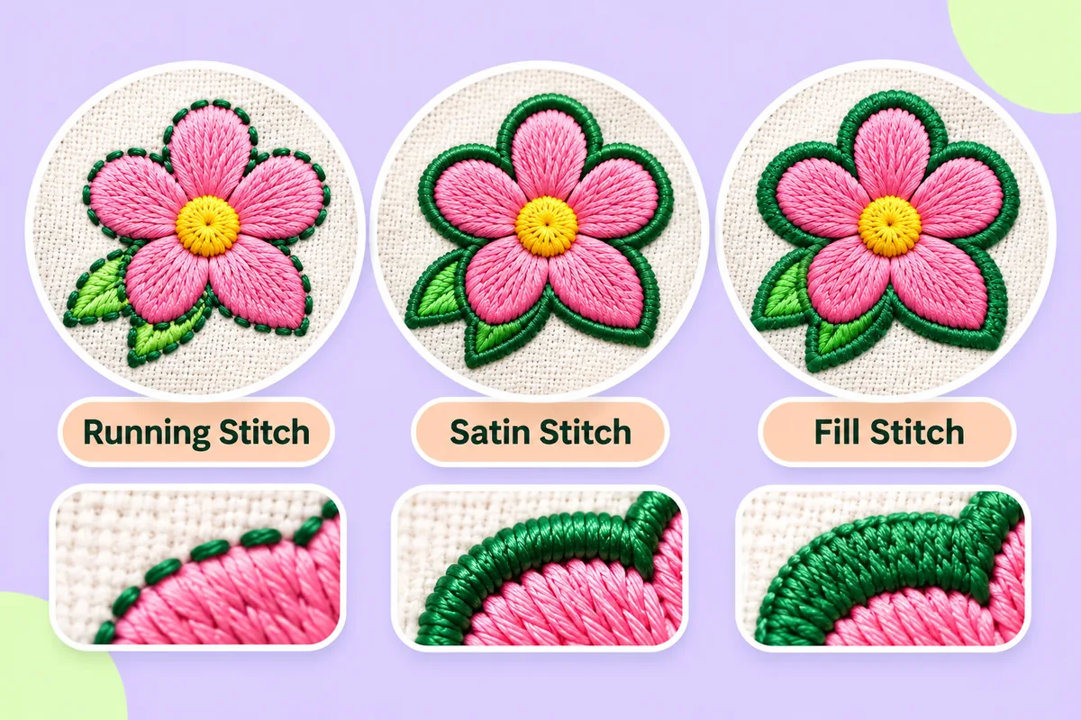
Running stitch is a single line of simple stitches. It is the thinnest option and has a light, delicate look. It can be repeated to look thicker, but it never looks bold. It suits fine detail and outlines that should stay subtle.
Satin stitch is a column of stitches sewn side to side across the line. It gives a smooth, solid, slightly raised stroke. It suits lines with some thickness. Very wide columns become loose, which is covered in Satin stitch vs fill stitch.
Fill stitch is for areas, not lines. If a "line" in your artwork is thick enough to behave like a shape, the software may treat it as a fill.
Which one to choose
- A fine outline around a shape: running stitch, if you want it light.
- A bold outline or a line meant to stand out: satin.
- A line that is neither clearly thin nor clearly thick: usually the awkward middle, where results vary most.
The awkward middle is where most problems arise. A line too thick for running stitch but too thin for satin can look patchy or break up.
Fixing hairline strokes in your artwork
The simplest fix is in the artwork, before conversion.
- Make thin strokes thicker. Give lines enough weight to be stitched as a proper column.
- Merge nearby lines. Two close parallel lines often blur into one.
- Turn outlines into shapes. Instead of a thin stroke around a form, make the form slightly larger in a second colour.
- Delete decorative lines. If a line is minor, removing it may improve the whole logo.
This is the same discipline as keeping lettering readable. See Minimum text size in embroidery for how small details fail.
Outlines and pull
Outlines are where gaps most often appear. Fills pull inward as they are sewn, so an outline can end up sitting slightly apart from the shape it surrounds. A small overlap between fill and outline hides this. The cause and the fix are explained in Pull compensation in embroidery.
Lines on stretchy and textured fabric
Thin lines struggle most on knits and towelling. The fabric moves and the surface swallows the stitches. On these materials, make lines bolder than you think you need, and consider a topping layer for textured surfaces. See Embroidery on stretchy fabrics.
Colour and contrast
A thin line in a colour close to its background will almost vanish. Use clear contrast, and keep the number of colours down. Embroidery logo colours: how many? explains why each extra thread colour adds sewing time.
What automatic conversion does
Conversion software makes decisions for you. A thin line might be transformed into a straight stitch, a narrow satin stitch column, or it might simply disappear. Check the preview to identify any lines that have vanished or broken up into dashes. Then run a test: only by stitching on actual fabric can you confirm whether a line holds up properly.
Automatic results can need editing, so always test-sew on a scrap of similar fabric before proceeding with the final embroidery.
Where to start
Open your artwork, thicken any hairline strokes and remove lines you do not need. Then upload it to the converter on this site and look at the preview line by line. Anything that looks weak there will look weaker on fabric.
FAQ
Why do thin lines disappear when embroidered?
Thread has its own width, so a line thinner than a stitch is thickened or dropped, and soft fabric can swallow it further.
Should I use running stitch or satin for a line?
Running stitch for light, delicate lines. Satin for lines that need to look bold and solid.
How can I make an outline look stronger?
Thicken it in the artwork, use clear contrast against the background, and consider a satin column instead of running stitch.
Why is there a gap between my outline and fill?
Fills pull inward as they are sewn. A small overlap between fill and outline hides the gap.