Why embroidery differs from the screen
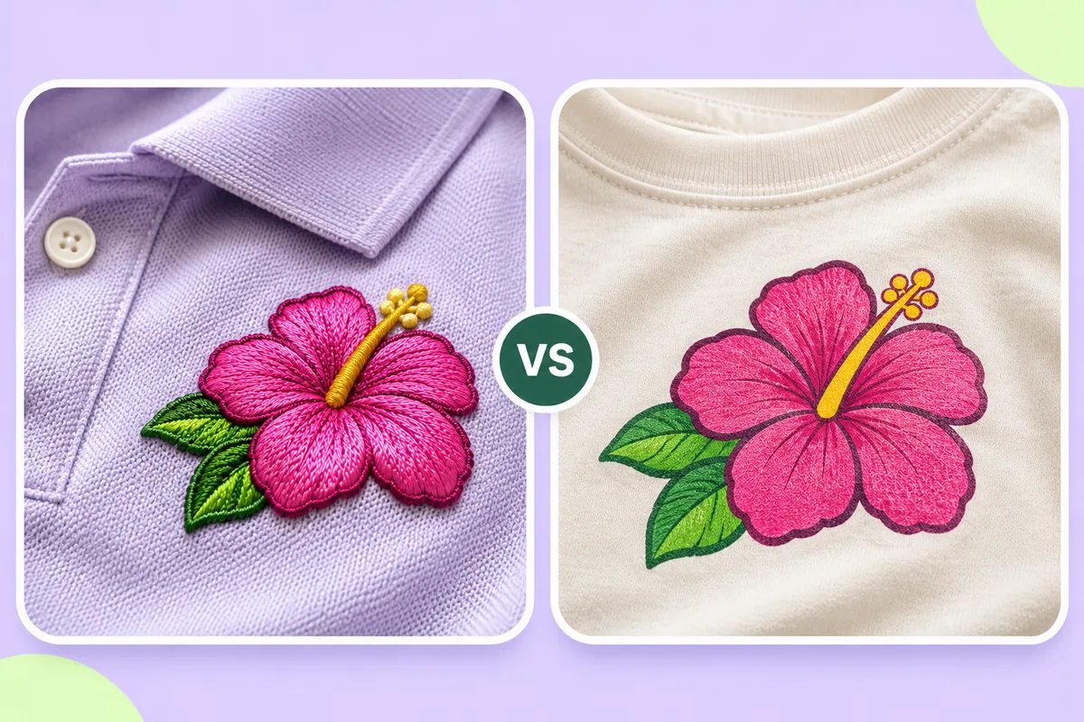
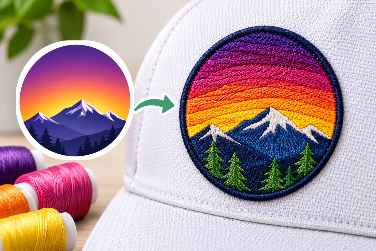
Thread reflects light differently from a screen, stitches have width, fabric pulls shapes and colours are reduced to a few threads. Expect a close match rather than a copy: simplify small details, choose thread on fabric, and test-sew.

You approve a logo on screen, have it embroidered, and the result turns out differently. The colors don't quite match, the outlines are less sharp, and some small details have disappeared. This is normal; it is largely due to the fundamental difference between thread and pixels.
Thread is not light
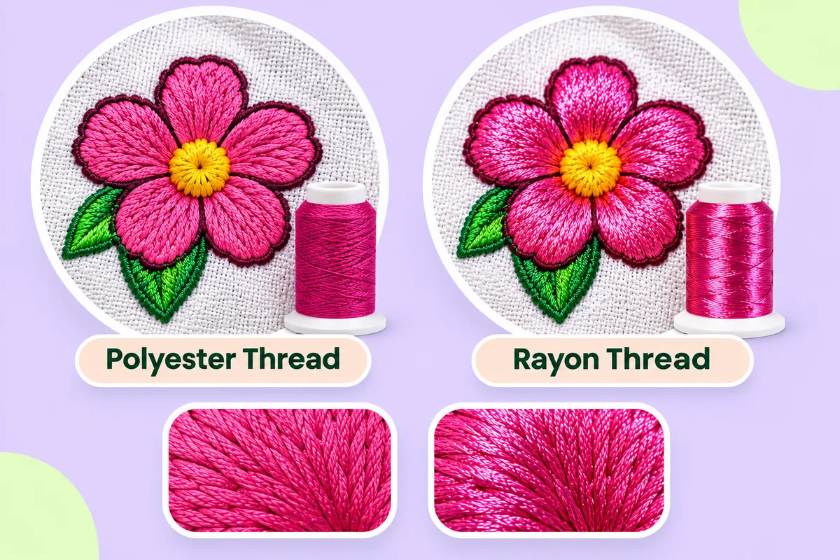
A screen creates colors using light and can display millions of different shades. Thread is a physical material with a limited color range; it reflects light differently depending on its sheen and the angle from which it is viewed. A thread that appears to match on a color chart may look slightly different on a screen, and different again once it is applied to a fabric.
To evaluate a color, compare the sample against an actual physical thread color chart, rather than a screen. See Polyester vs rayon embroidery thread for how thread type affects shine.
Stitches have width
A pixel can be tiny. A stitch cannot. Every thread has a certain thickness; consequently, the finest details of a design must be thickened, simplified, or removed. This is why fine outlines, tiny text, and sharp angles become softened. See Thin lines and outlines in logos and Minimum text size in embroidery.
Fabric pulls shapes
Stitches tug the fabric inward as they are sewn, so shapes shift from the drawing. Circles squash, gaps open and thin parts weaken. Digitizers correct for this, but the correction is never exact. See Pull compensation in embroidery.
The surface changes the look
Smooth fabric shows stitches crisply. Soft or textured fabric lets thread sink in, which blurs edges. Stretchy fabric can distort the whole design. See Embroidery on stretchy fabrics.
Colours are reduced
Artwork may have many shades, shadows and gradients. Embroidery needs a small set of flat thread colours, so subtle shading becomes bands or disappears. See Gradients and photos in embroidery and Embroidery logo colours: how many?.
Texture is part of the look
Stitched areas have direction and a slightly raised surface. Light catches the stitches, so a filled shape looks textured rather than flat. This is part of the charm of embroidery, but it means a flat logo will never look flat in thread.
How to get closer to the original
- Simplify the artwork first. Flat colours, clean edges and bold shapes convert well.
- Choose thread from a physical chart.
- Make details bigger or remove them.
- Use a design size that suits the detail.
- Use the right stabilizer for the fabric.
- Sew a sample and compare it to the printed logo, not the screen.
Use the preview wisely
A stitch preview shows shapes and colours but not how fabric and thread behave. It is a good guide, not a final answer. See Prepare a logo for embroidery.
Automatic results can need editing, so always test-sew on a scrap of similar fabric before a real run.
Setting expectations with clients
If you sew embroidery for others, it is helpful to explain these differences before beginning the work. A brief note will suffice: the colors will be close to those shown on screen but not strictly identical, finer details may be simplified, and the final logo will have a raised, textured appearance. Ideally, you should provide a sample embroidered on a similar type of fabric; people tend to judge based on the actual, tangible result rather than just a description.
What counts as a good match
A well-embroidered logo is not a pixel-for-pixel reproduction. It must be recognizable, legible, and balanced, with accurate colors and proportions. If your sample meets these criteria, then any slight variations in sheen, the softness of the outlines, or the texture are simply inherent to the medium itself; they are not defects.
Where to start
Upload your logo to the converter on this site at /upload, review the preview, then sew a sample and hold it next to a printed copy of the artwork.
Frequently asked questions
Why are my embroidery colours different from my screen?
Screens use light, thread uses pigment and sheen. Match colours against a physical thread chart instead.
Why did small details disappear?
Stitches have width, so very fine details are thickened or dropped. Enlarge them or simplify the artwork.
Can embroidery look exactly like a printed logo?
Not exactly. Texture, thread colour range and stitch width always make it a little different.
Does fabric change how the logo looks?
Yes. Smooth fabric shows crisp stitches, while soft or stretchy fabric can blur or distort them.